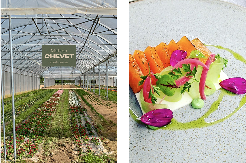
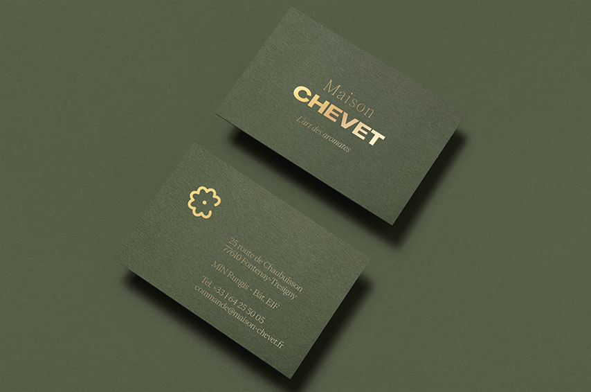
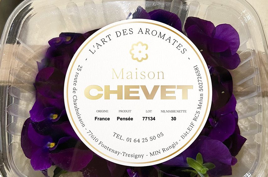
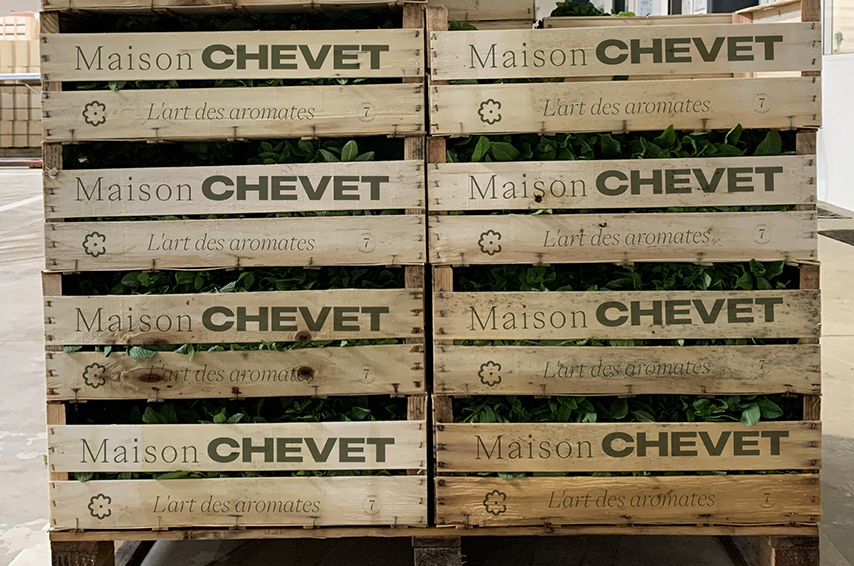
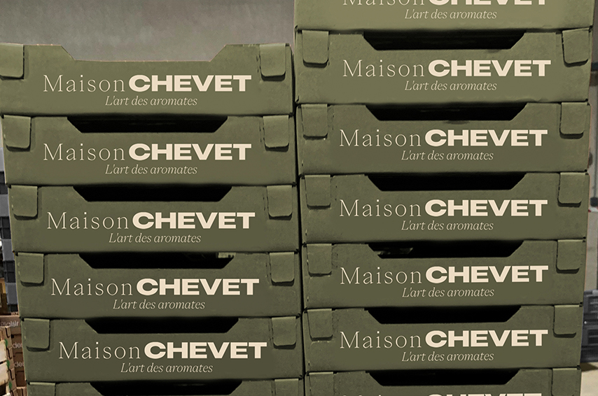
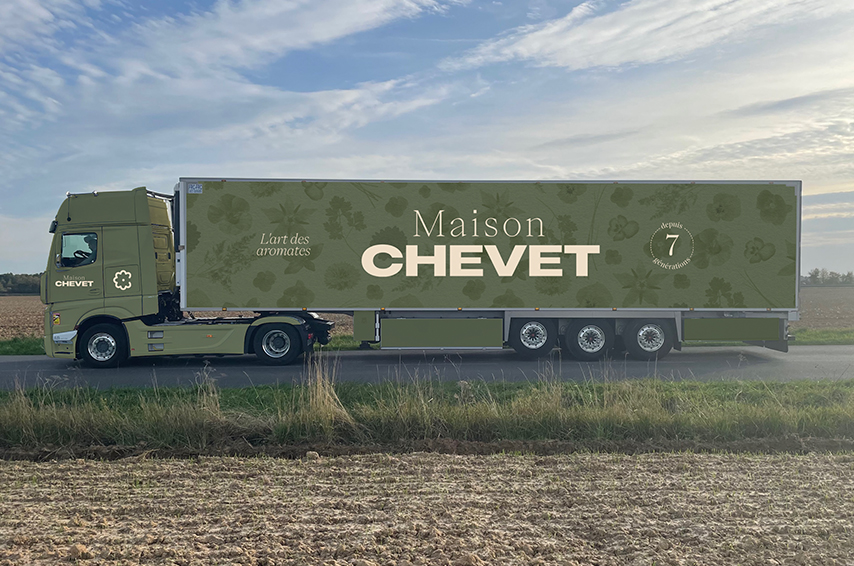
MAISON CHEVET
Maison CHEVET cultivates edible flowers and aromatic herbs for 7 generations.
A fascinating subject that transports us from the ground to the plate.
The objective of this rebranding is to show the high quality of the products, to give a premium and timeless image.
A symbol completes the logo: a monogram C which immediately evokes a flower,
and more subtly the 7 generations of the family through the petals.
Logo design – Brand identity – Stationary – Packaging
![]()
![]()
![]()

![]()

Art Direction & Graphic Design with Agence LAPETITEGROSSE
Typography – Pangram Pangram
Copywritting – Clothilde Clément